Image Gallery Optimization
project overview
client:
Canadian Tire
services:
UXUI Enhancement
industry:
E-Commerce
role:
UI Designer
About
Understanding Products Through Visual Experience
On a product page, the gallery is often the closest thing to holding the item in your hands. When it fails - when users can't tell how many images exist, or miss a video entirely - confidence drops and so does conversion. That was the problem we set out to fix.
Problem
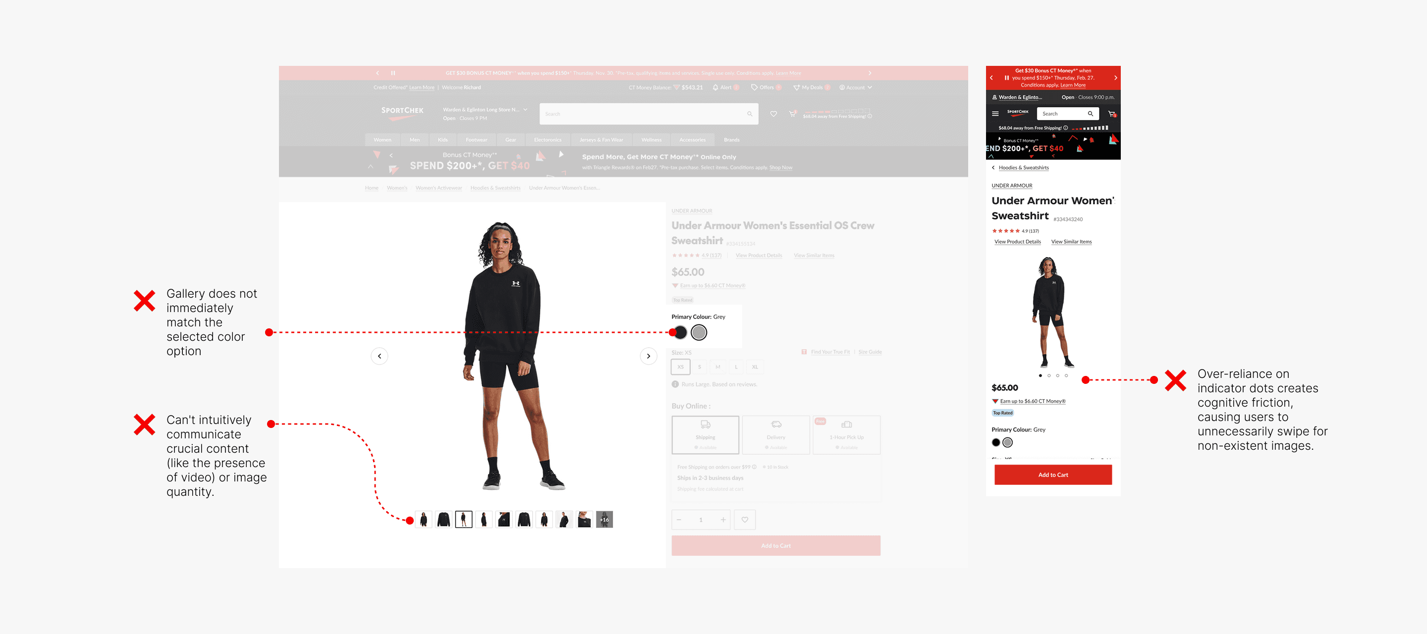
Hidden Information Creates Cognitive Friction
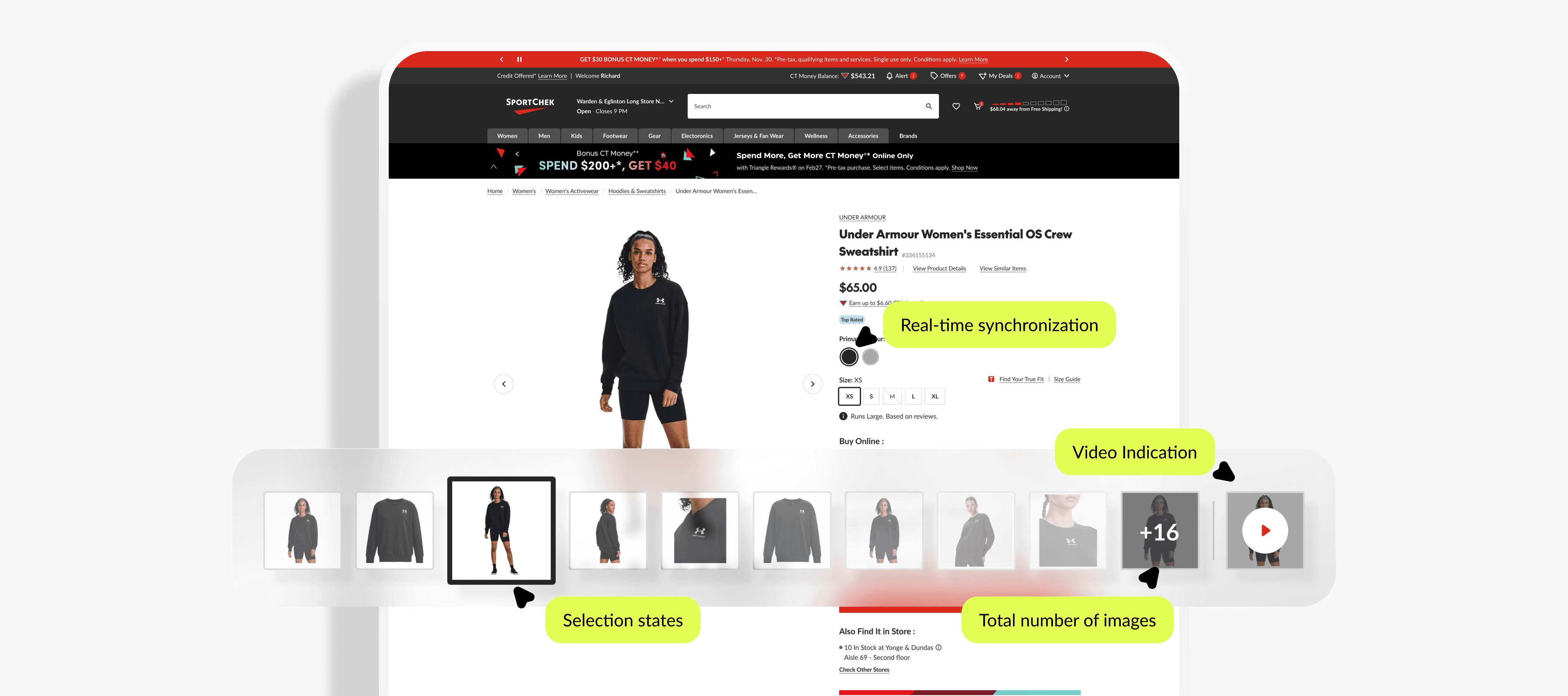
The current mobile PDP gallery relies heavily on indicator dots, creating unnecessary cognitive load. Users often assume more content exists and continue swiping without clear direction.
As highlighted by Baymard research, this pattern fails to communicate essential information - such as total image count or the presence of video - reducing product clarity, weakening user confidence, and ultimately impacting purchase intent.
Challenge
Balancing Clarity, Scalability, and System Constraints
The challenge was to design a scalable gallery experience that clearly communicates different media types (images and videos), enables seamless interaction, and works across Canadian Tire’s ecosystem. This required building a flexible solution that could be deployed via AEM across seven banners—each with distinct business requirements—while maintaining consistency and usability.
Research Insight
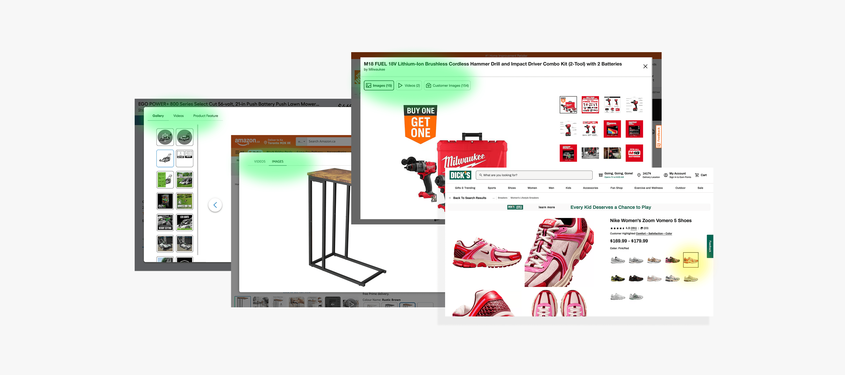
Learning from Industry Patterns and User Expectations
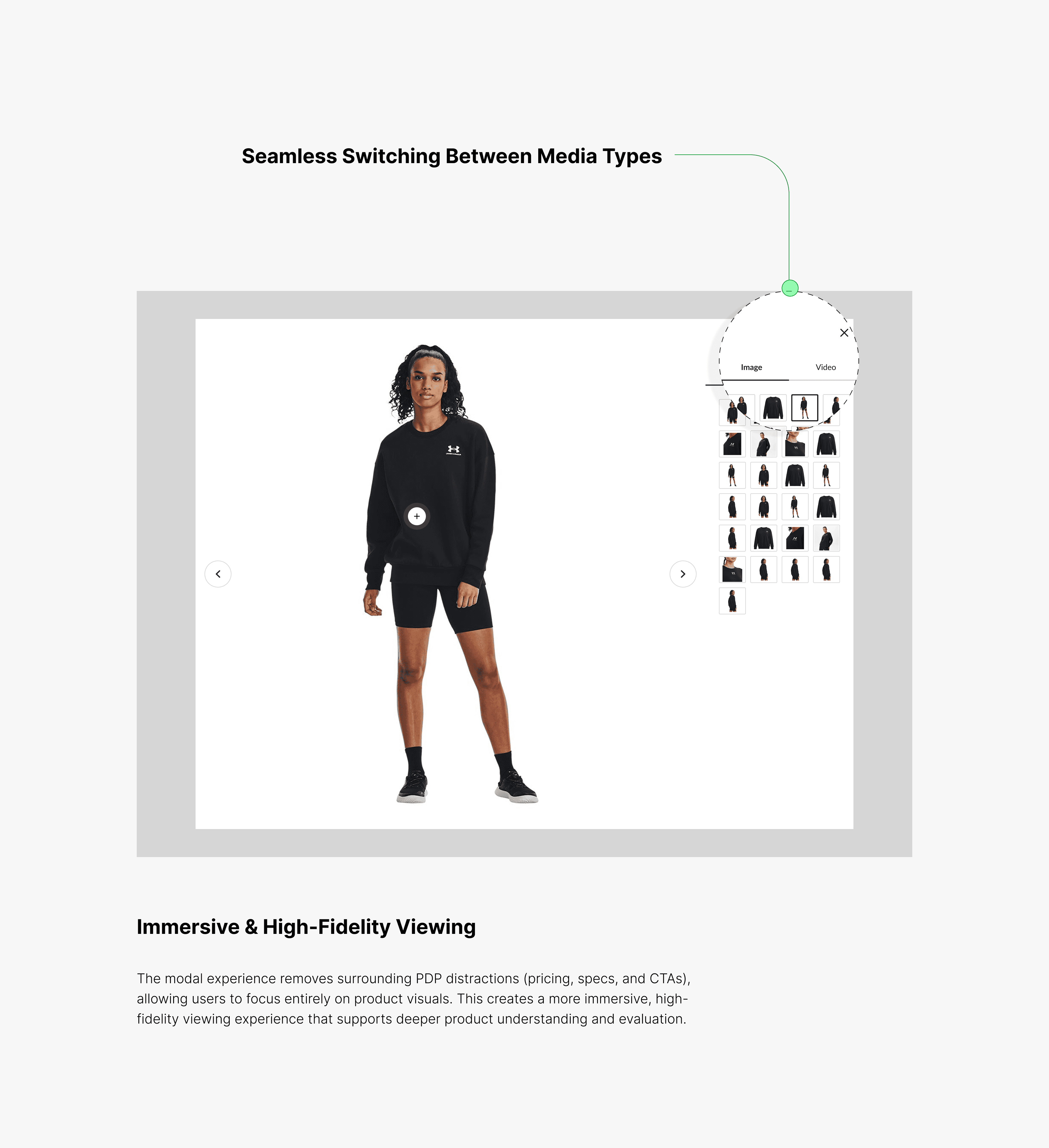
We analyzed leading eCommerce platforms such as Amazon and observed a consistent pattern: a large, centered modal gallery that removes PDP distractions (e.g., pricing and CTAs), allowing users to focus on high-fidelity product visuals.
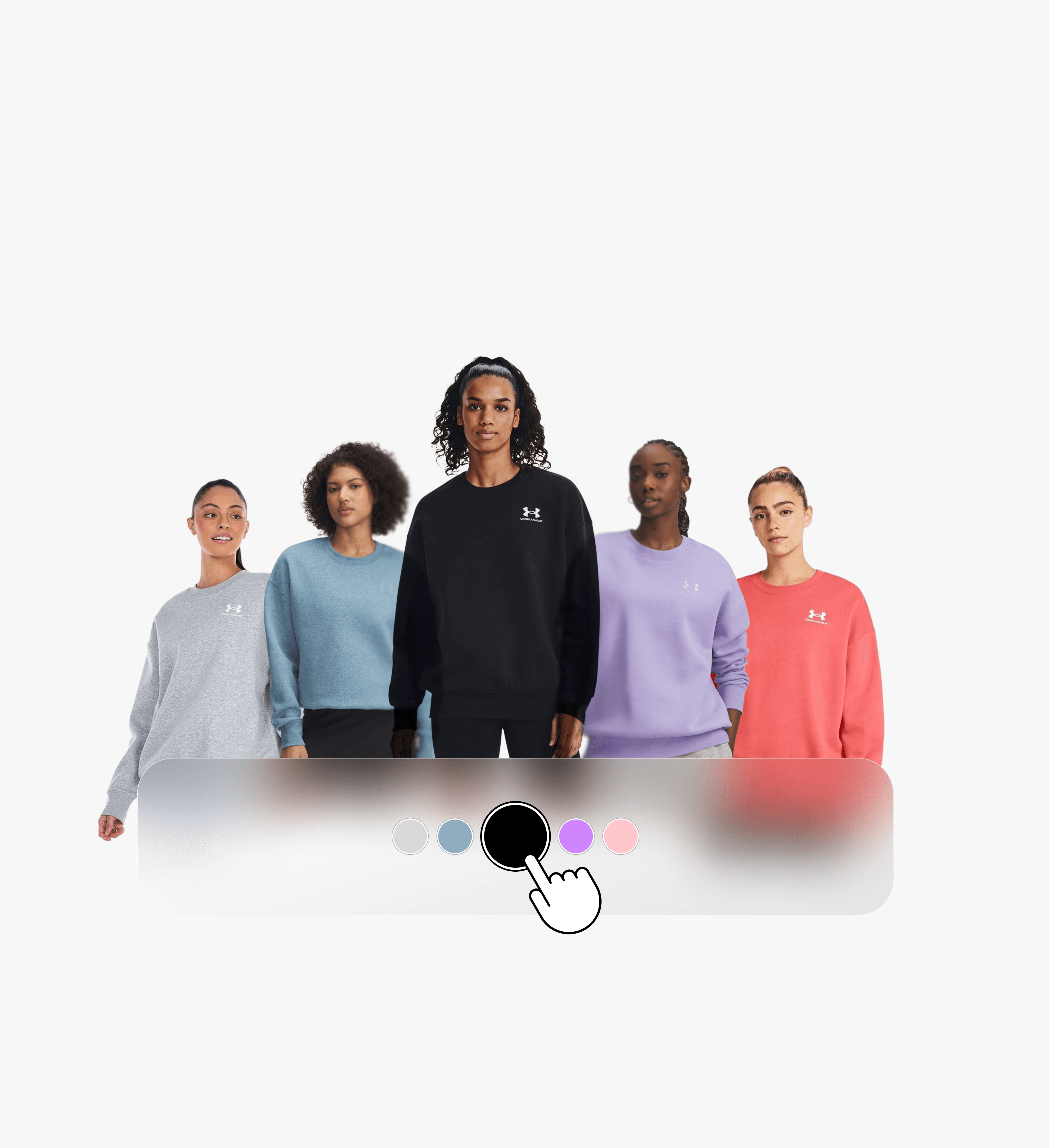
We also identified a critical best practice—real-time image synchronization. When users select a product variation (e.g., color), the gallery must instantly reflect the correct visuals. This immediate feedback loop reduces uncertainty, builds trust, and supports faster decision-making.
HOW WE IMPROVED IT
Solution
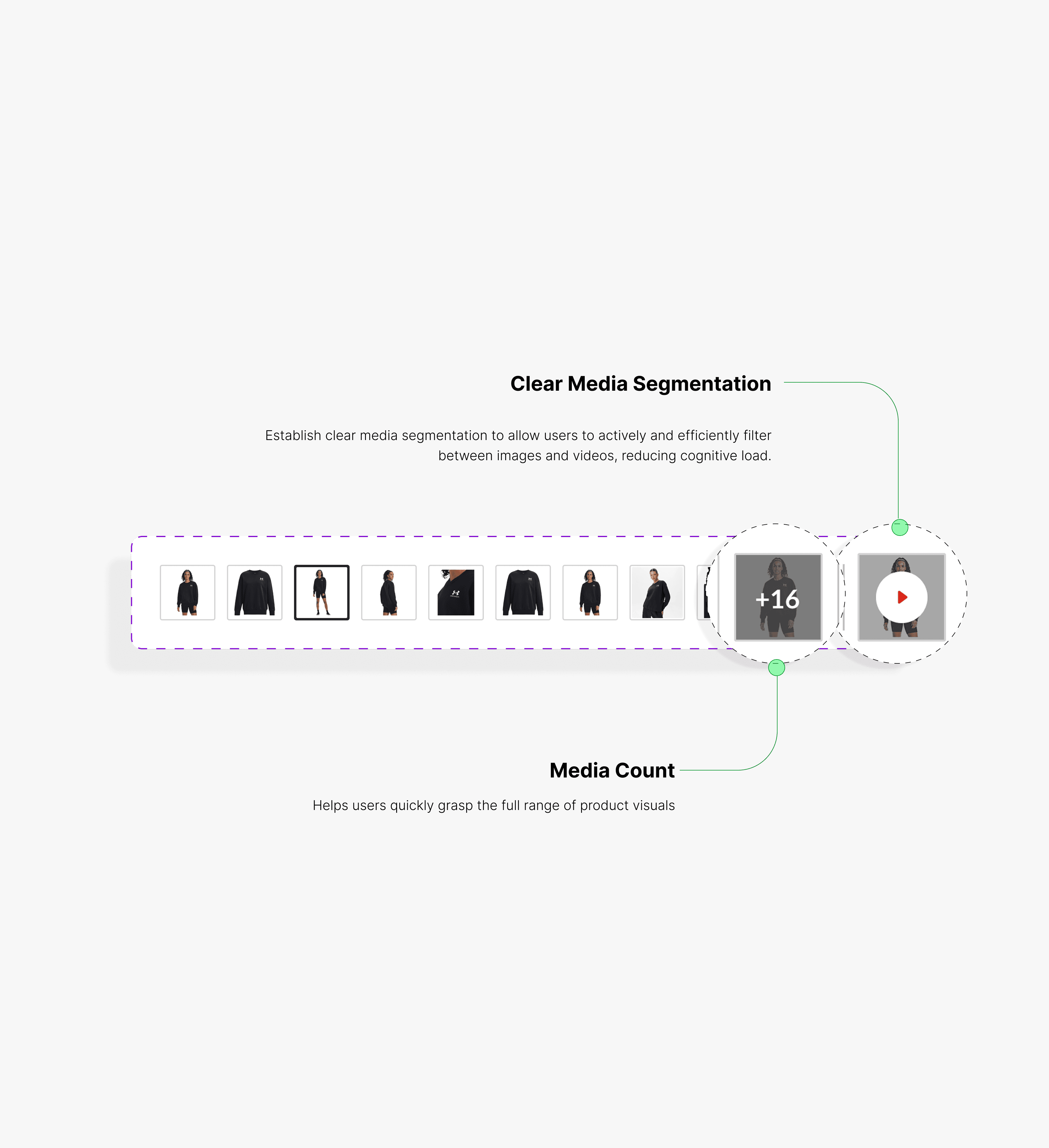
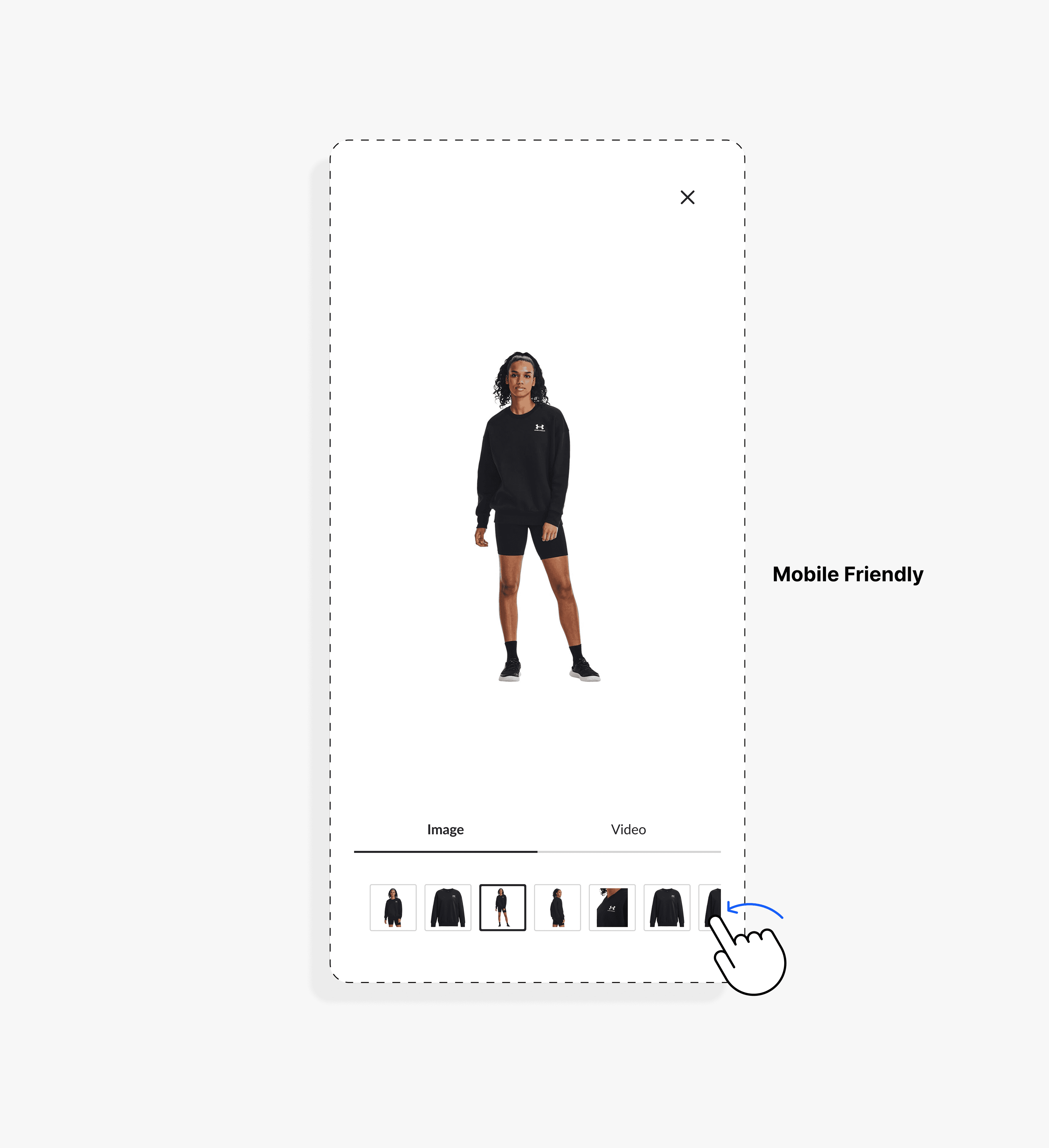
Reducing Friction Through Clear and Scalable Visual Design
Indicator dots were replaced with visible thumbnails - users need to see the destination, not just know one exists. This single change naturally surfaced video content and media count without introducing new UI elements.
Real-time variant synchronization was added to ensure gallery visuals update instantly on color or option selection, closing a key trust gap in the evaluation flow.
The solution was architected as a reusable AEM component, enabling consistent deployment across all seven Canadian Tire banners with no per-banner customization overhead.
Impact
📈 Increased Engagement Through Improved Visibility
+14.8% increase in image engagement, driven by clearer media visibility and reduced interaction friction
👁️ Faster Product Evaluation & Stronger User Confidence
Validated through usability testing. Improved visual hierarchy and navigation enabled users to quickly understand available media, explore product details more efficiently, and make more confident purchase decisions