Cart Redesign
project overview
client:
Canadian Tire
services:
UXUI Enhancement
industry:
E-Commerce
role:
UI Designer
About
Redesigned the cart experience to improve fulfillment clarity, reduce checkout friction, and support scalable commerce needs across multiple banners.
Redesigned the cart experience to improve fulfillment clarity, reduce checkout friction, and support scalable commerce needs across multiple banners.
Problem
Fragmented Fulfillment Experience Reducing Decision Clarity
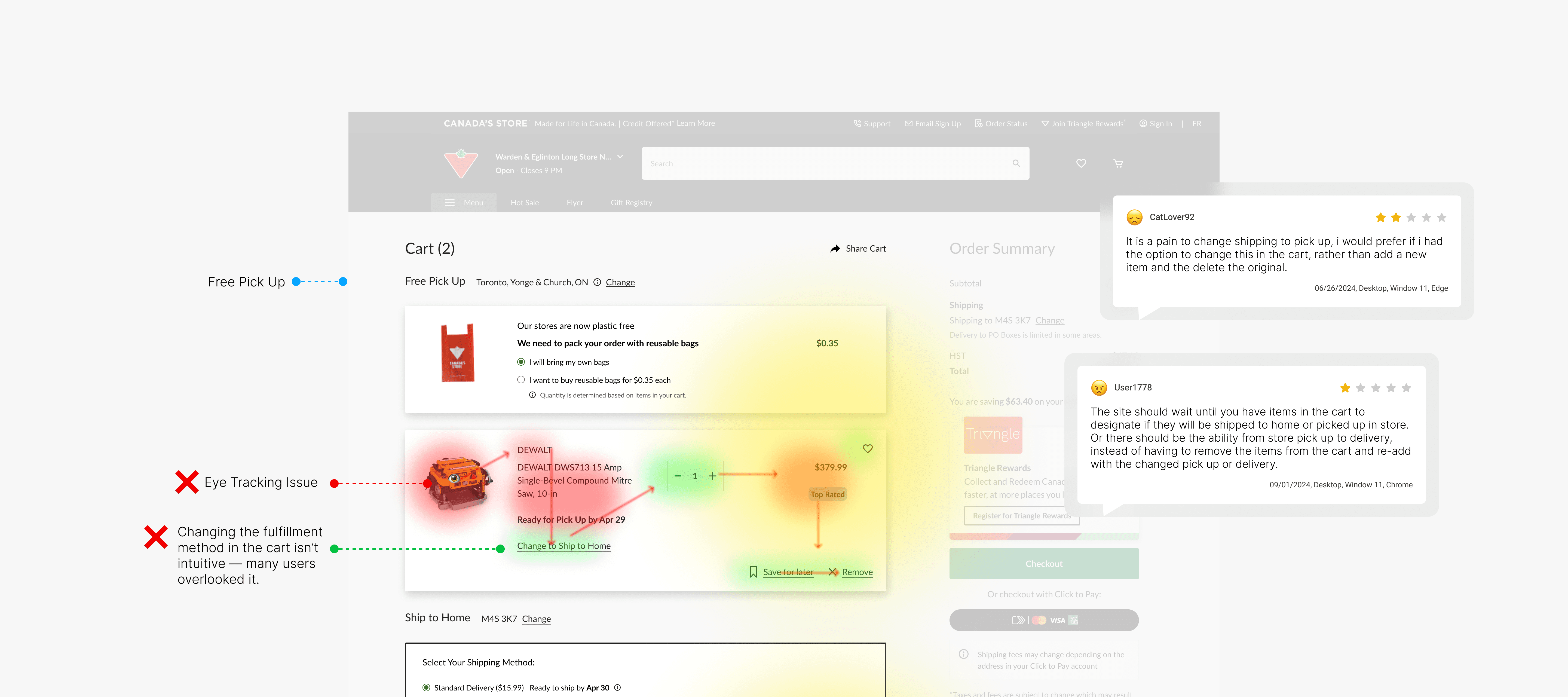
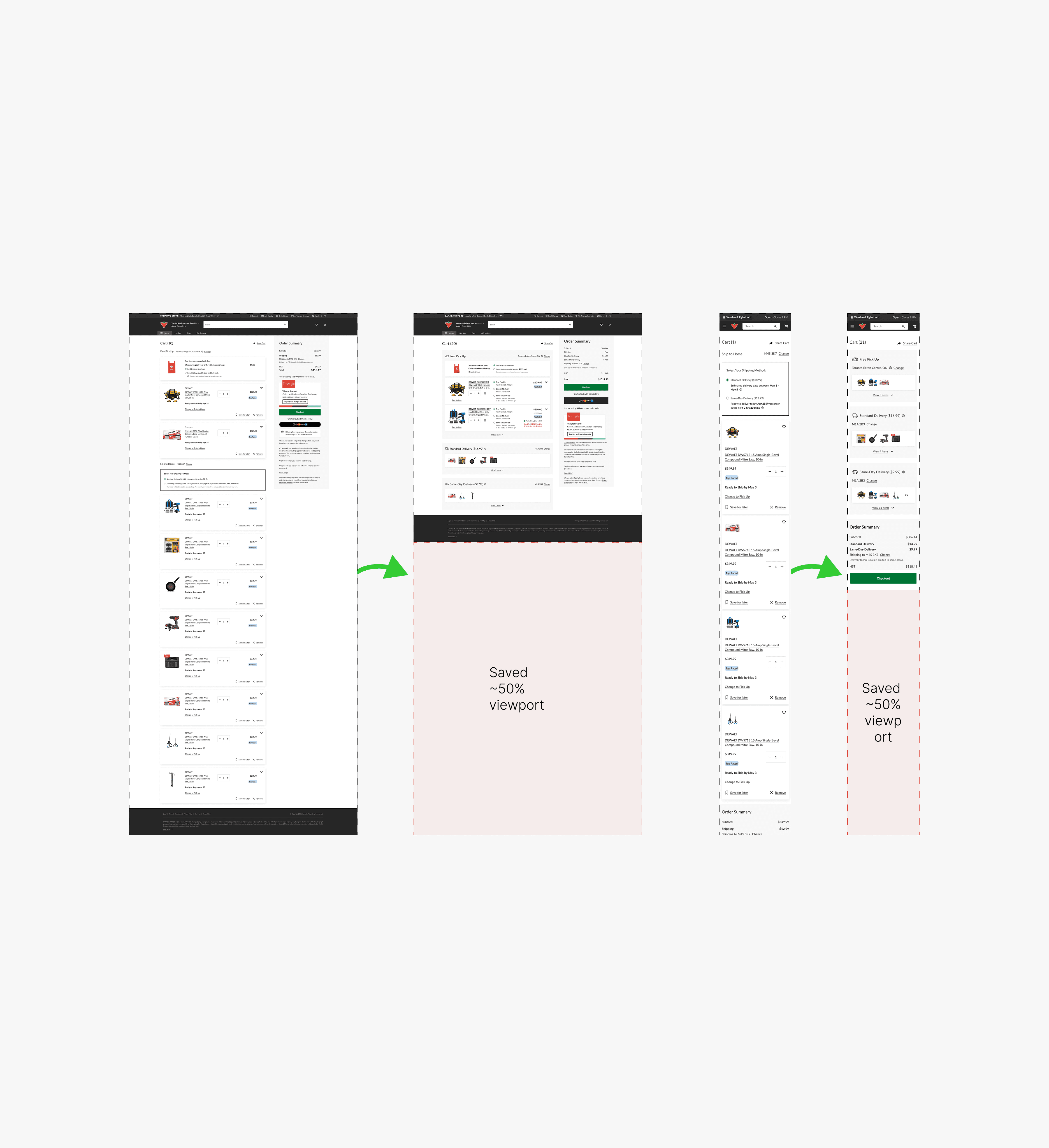
Fulfillment options (Pickup vs. Delivery) lacked visibility within the cart, making it difficult for users to understand and act on their choices.
Switching fulfillment methods required navigating back to the product page, introducing unnecessary friction in the checkout flow.
Key information such as delivery dates and fees was not clearly surfaced, limiting users’ ability to compare options effectively. This resulted in a fragmented experience that slowed decision-making at a critical conversion point.
Challenge
Scaling a Unified Experience Across Multi-Banner Constraints
The solution needed to work within AEM constraints while supporting Canadian Tire and its multiple banners, each with distinct business needs.
This required a flexible yet consistent system that could adapt to different fulfillment scenarios while remaining scalable for future features such as multi-buy.
Research Insights
Users struggled to locate and switch fulfillment options within the cart Delivery information (date & fees) was not easily comparable Interaction points were not aligned with user expectations, causing hesitation Inconsistent patterns across banners increased cognitive load
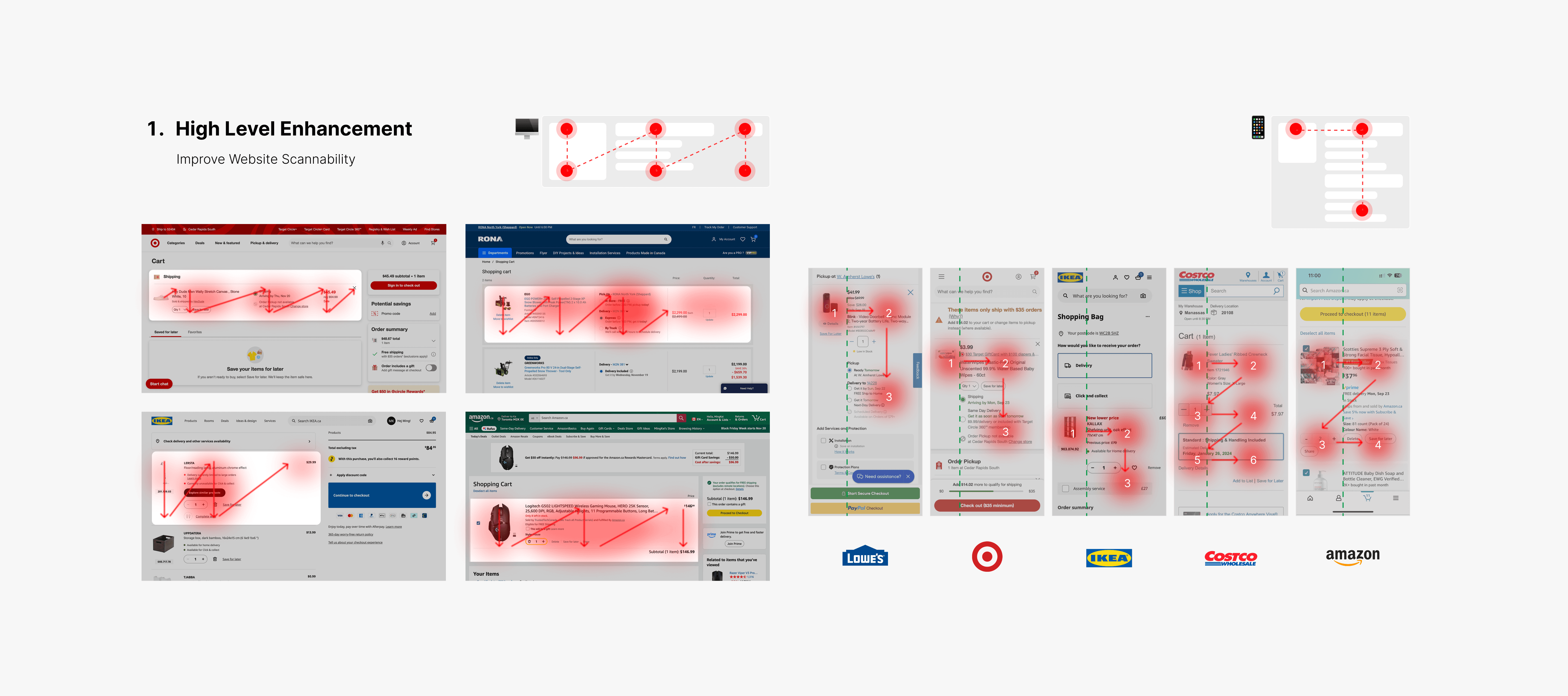
Competitor analysis shows that leading retailers surface fulfillment options directly on product cards, enabling easy comparison and seamless switching between methods.
In contrast, Canadian Tire hides these options behind a secondary link, reducing visibility and introducing unnecessary friction.
The current layout also lacks clear hierarchy, making key information—such as delivery options, pricing, and availability—hard to scan and evaluate.
HOW DID WE IMPROVE IT?
Solution
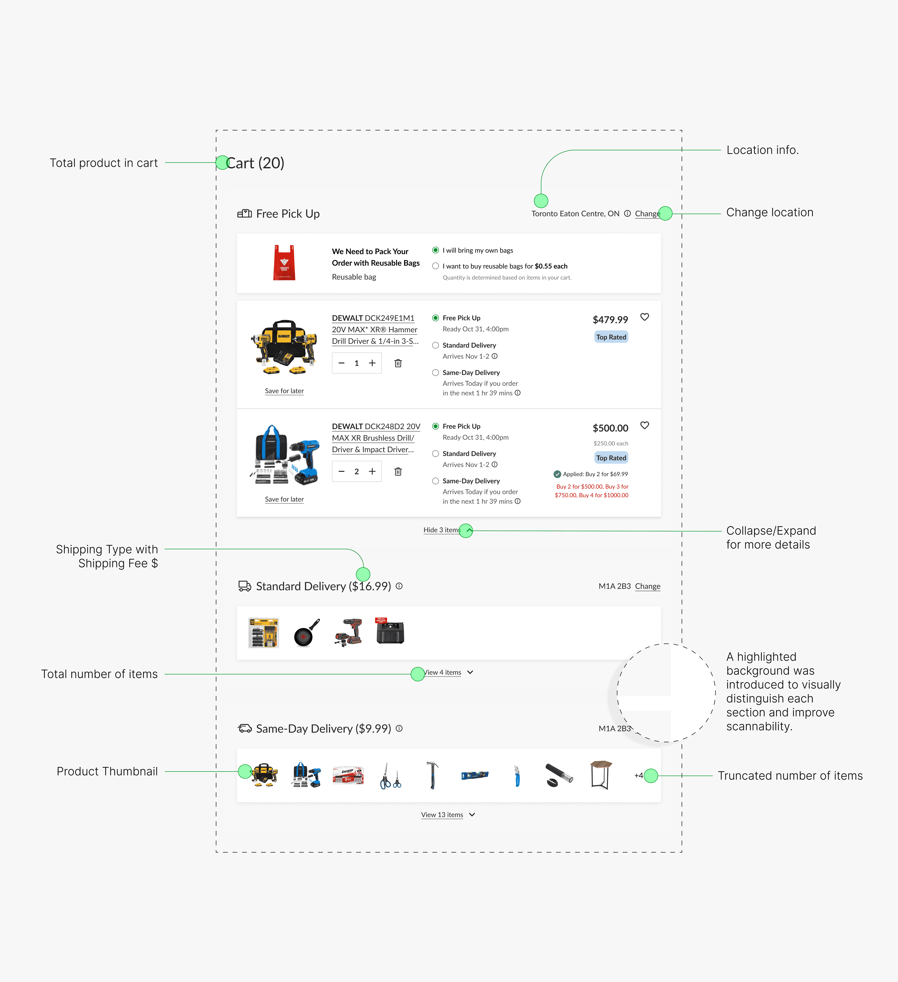
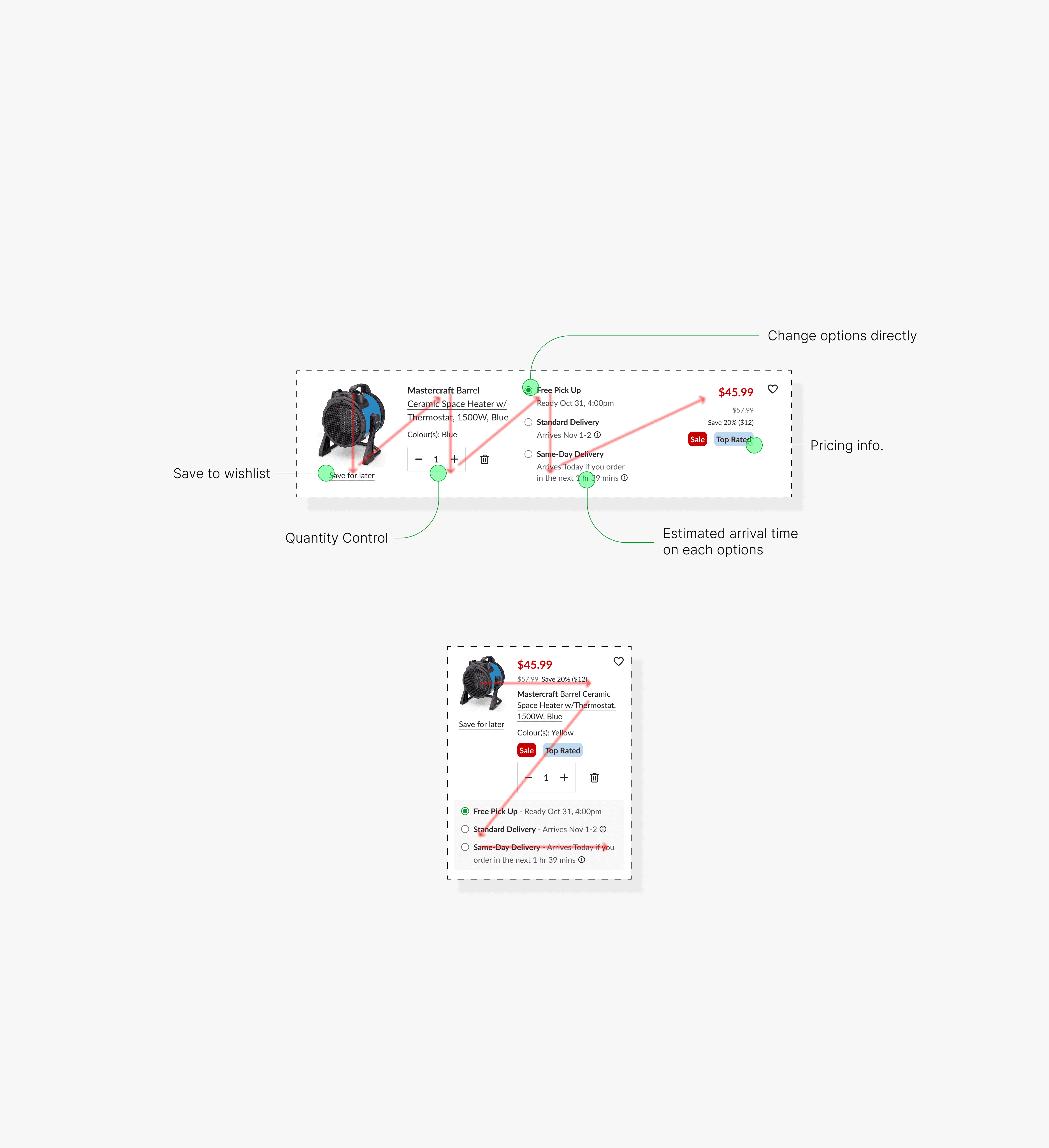
Reframed the cart as an interactive decision layer by improving fulfillment visibility and enabling direct interaction within the cart.
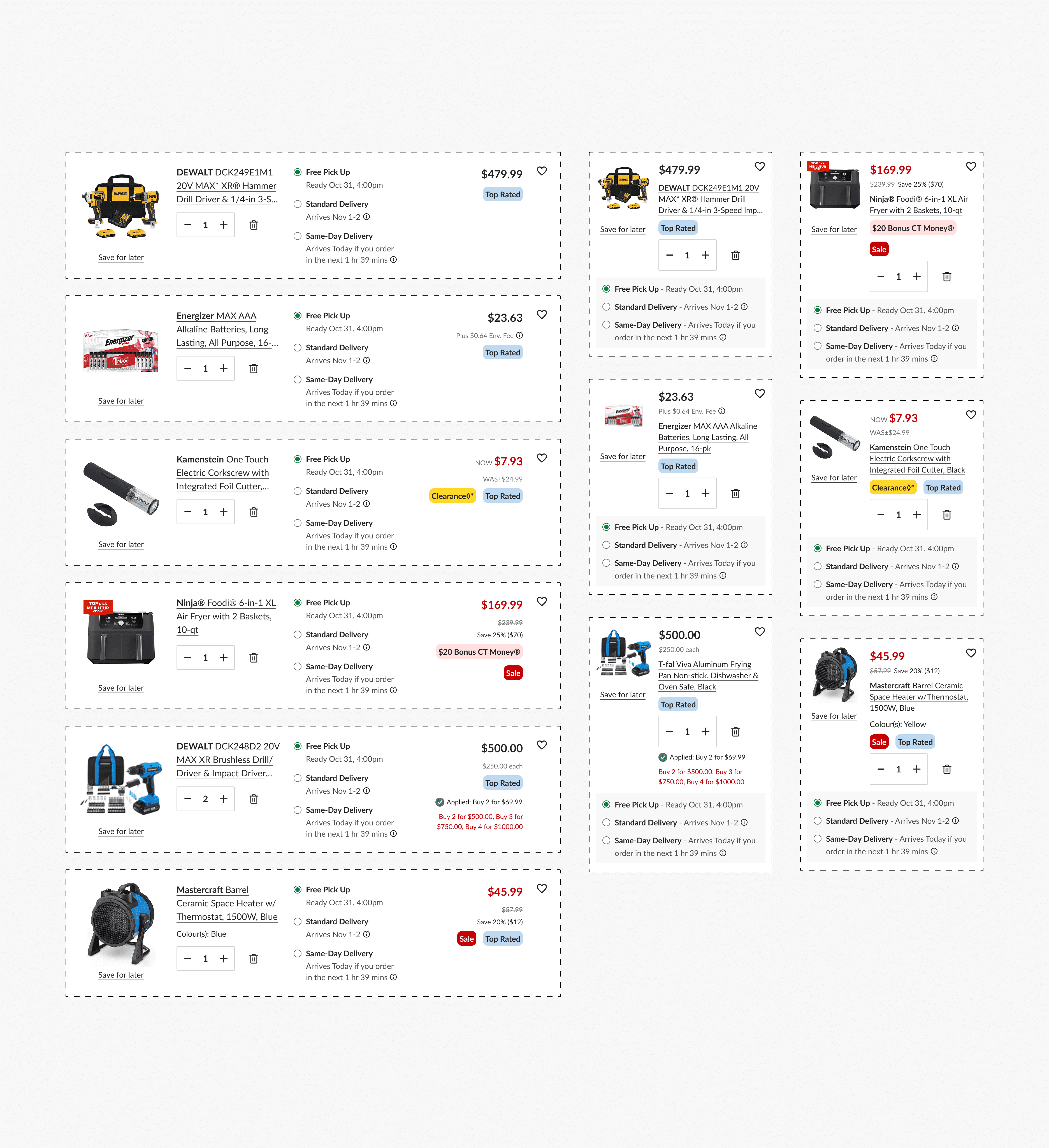
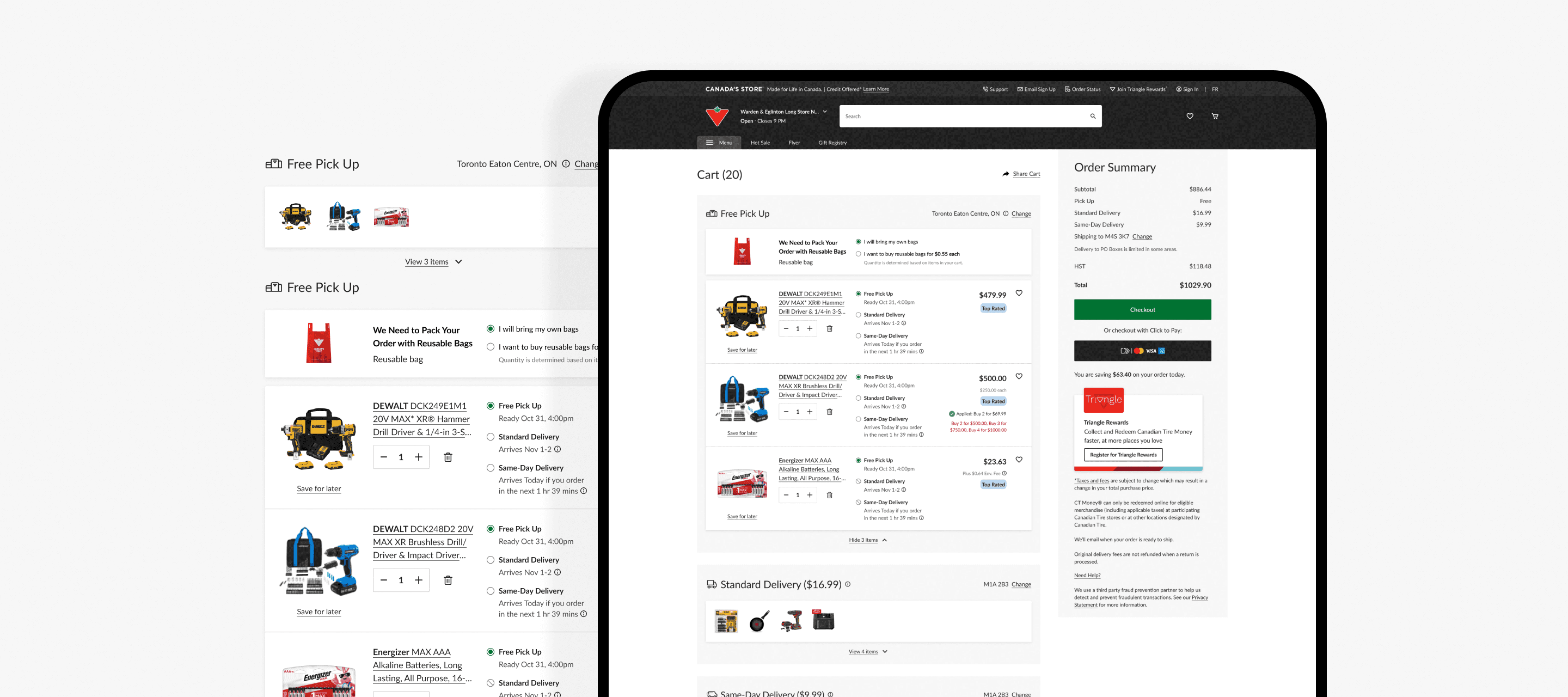
✅ Surfaced fulfillment options at the product level for better visibility
✅ Enabled users to switch between pickup and delivery directly within the cart
✅ Highlighted delivery dates and fees to support quick comparison
✅ Improved layout hierarchy to guide attention toward key actions
This approach reduced friction and allowed users to make faster, more confident decisions without leaving the cart.
Impact
The redesign turned the cart from a passive list into an active decision layer. One metric tells the story:
📈 +10.57% increase in Cart-to-Checkout clicks
Validated through A/B testing over a 4-week period across all Canadian Tire banners. This measurable uplift confirms that the redesigned cart successfully removed critical friction points in the checkout flow. By improving visibility, simplifying fulfillment switching, and reducing cognitive load, users were able to make faster decisions and proceed to checkout with greater confidence.